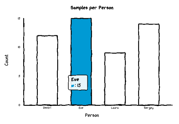
Bar
Bar chart.
Bar
Bases: _AxisChart
Bar chart with categorical x-axis.
By default renders only datasets[0]. Set grouped=True in options
to render all datasets as side-by-side bars within each category.
Parameters:
| Name | Type | Description | Default |
|---|---|---|---|
title
|
str | None
|
Chart title. |
None
|
x_label
|
str | None
|
Label for the x-axis. |
None
|
y_label
|
str | None
|
Label for the y-axis. |
None
|
labels
|
Any
|
Category names for the x-axis. |
required |
datasets
|
Any
|
List of dataset dicts, each with a |
required |
options
|
Any
|
Dict of chart options. |
None
|
Options:
backgroundColor(str): Background color (default'white').dataColors(list[str]): Bar colors.fontFamily(str): Font family (default'xkcd').grouped(bool): Render all datasets as grouped side-by-side bars (default False).strokeColor(str): Axis/border color (default'black').unxkcdify(bool): Disable hand-drawn style (default False).yMin(float): Minimum y-axis value (default 0).yMax(float): Maximum y-axis value (default data max).yTickCount(int): Number of y-axis ticks (default 3).
Example — simple bar::
Bar(
    title="Monthly Sales",
    x_label="Month",
    y_label="Revenue",
    labels=["Jan", "Feb", "Mar"],
    datasets=[{"data": [10, 20, 30]}],
)
Example — grouped bar::
Bar(
    title="Quarterly Sales",
    x_label="Quarter",
    y_label="Units",
    labels=["Q1", "Q2", "Q3"],
    datasets=[
        {"data": [10, 20, 30], "label": "Widgets"},
        {"data": [5, 15, 10], "label": "Gadgets"},
    ],
    options={"grouped": True},
)
Source code in src/chart_xkcd/bar.py
7 8 9 10 11 12 13 14 15 16 17 18 19 20 21 22 23 24 25 26 27 28 29 30 31 32 33 34 35 36 37 38 39 40 41 42 43 44 45 46 47 48 49 50 51 52 53 54 55 56 57 58 59 60 61 62 63 64 65 66 67 68 69 70 71 72 73 74 75 | |